
Biofrut




Biofrut
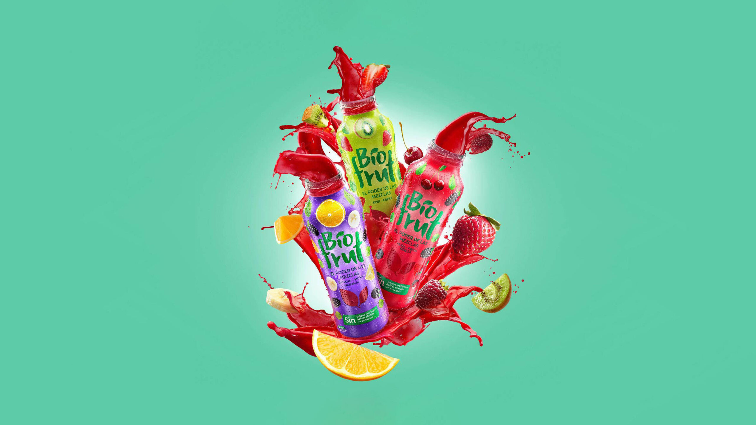
Our packaging design brief was to visually communicate the powerful and exotic combination of fruits present in this innovative beverage.
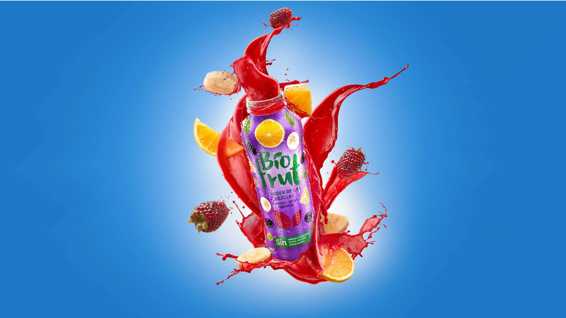
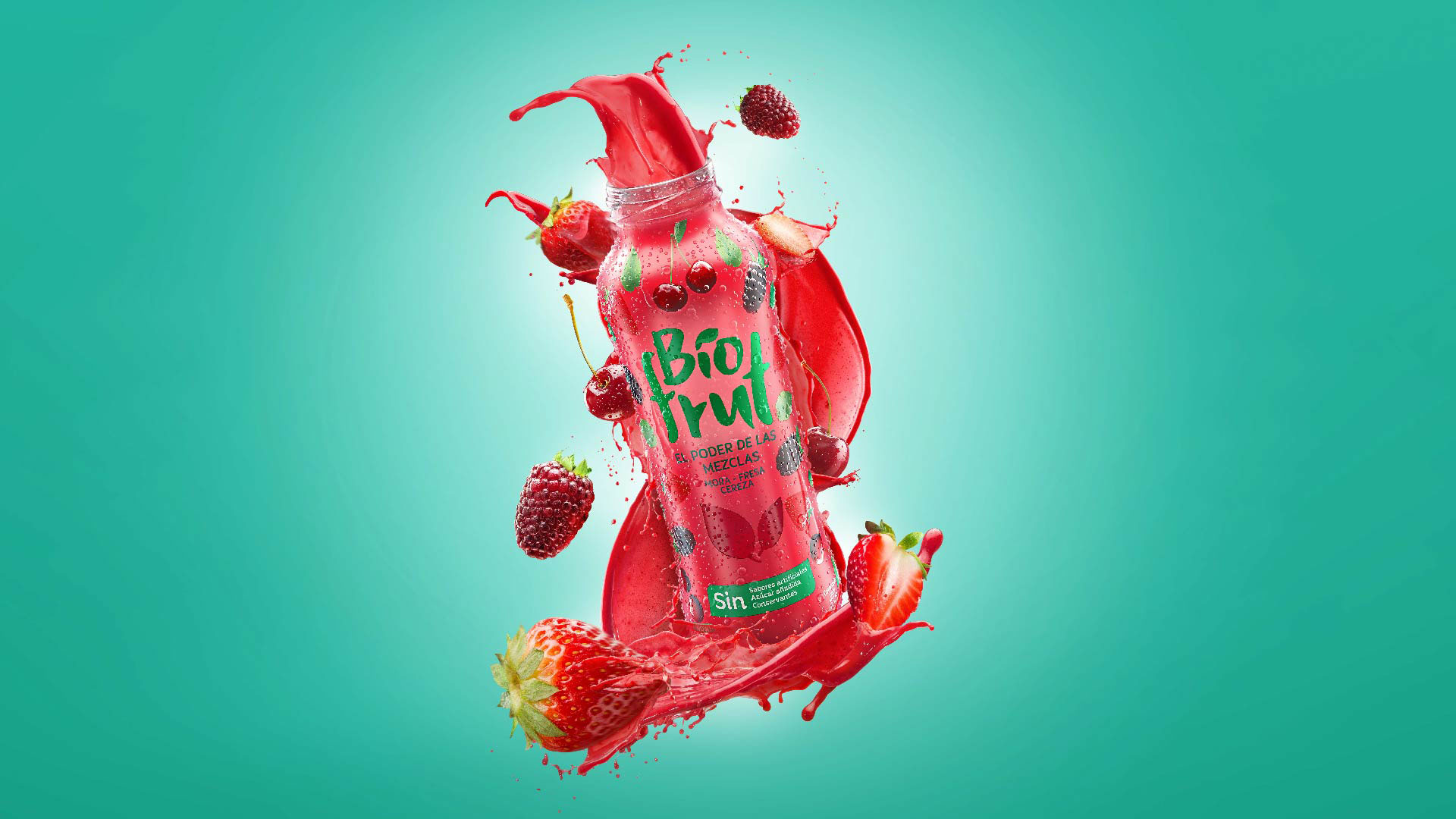
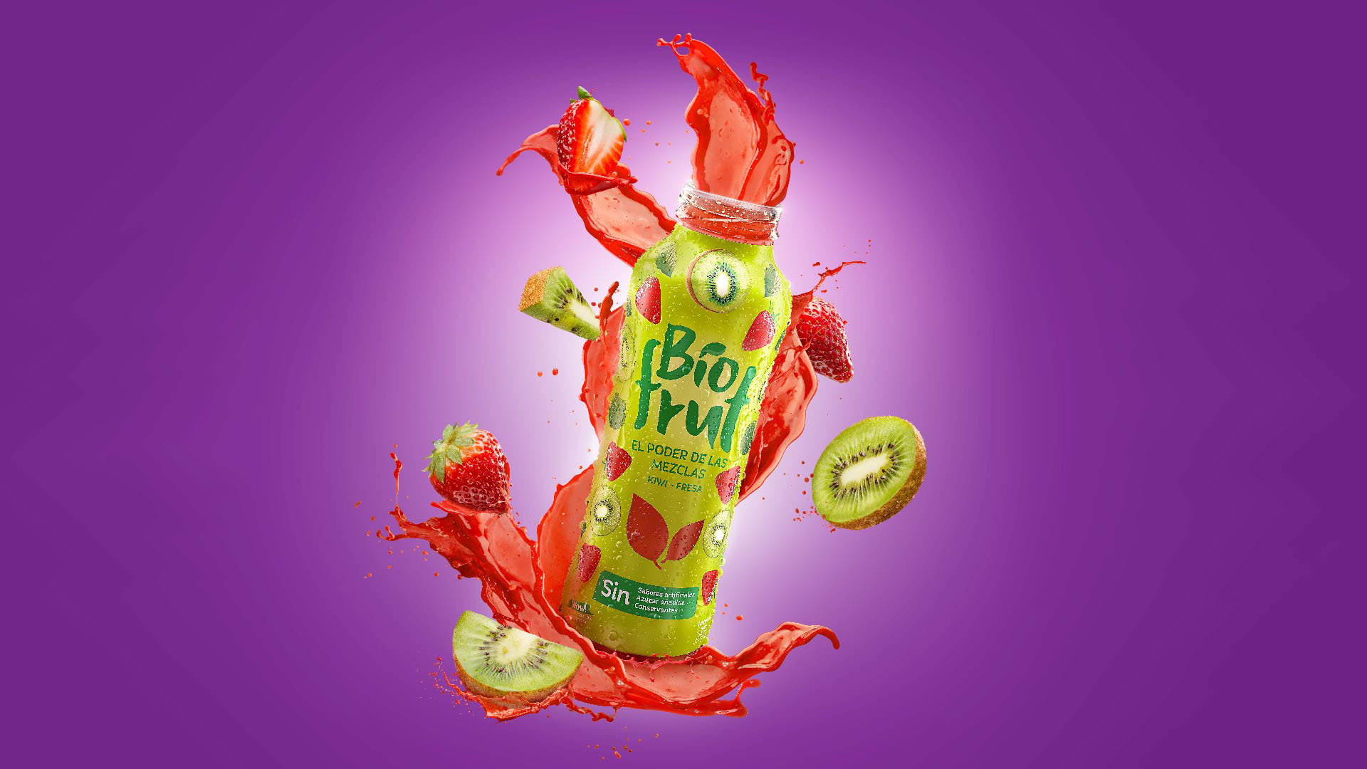
Our client Postobón created this product specially for those who constantly go beyond their limits, who seek new challenges. Those who dare trying new things and enjoy diversity. This beverage is inspired in the richness of nature, being innovative, delicious and bold. We translated this concepts into the visual identity and packaging architecture.
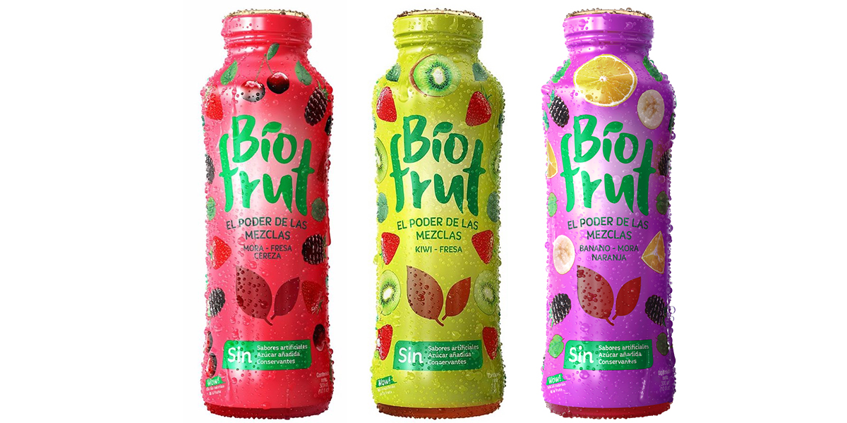
In the graphic design we chose vibrant colors that reflect the bold and dynamic character of the brand and its products. We proposed a full body label as a strategy to address full atention to the product in the point of purchase. This makes consumers rapidly be aware of Biofrut’s products. Each full body packaging design helps consumers differentiate between flavors, since the color of the liquid is fairly similar between them. To communicate in a fun and visual way the beverages’ flavours, we designed patterns with the fruits that are in each product variety. This graphic asset allowed us to add a dynamic element in the design of the labels.
When we work in a packaging project we always take into account information hierarchy. All this to make it easy for consumers to find what they need to know about the product in the point of purchase. All the design choices we made allow consumers to easily differentiate between the beverages and their flavours, while still recognize all products as the same brand.
Info
Branding, Packaging
