
Skandia






Skandia
Branding: Skandia, a well-remembered brand is ready to move into the digital world.
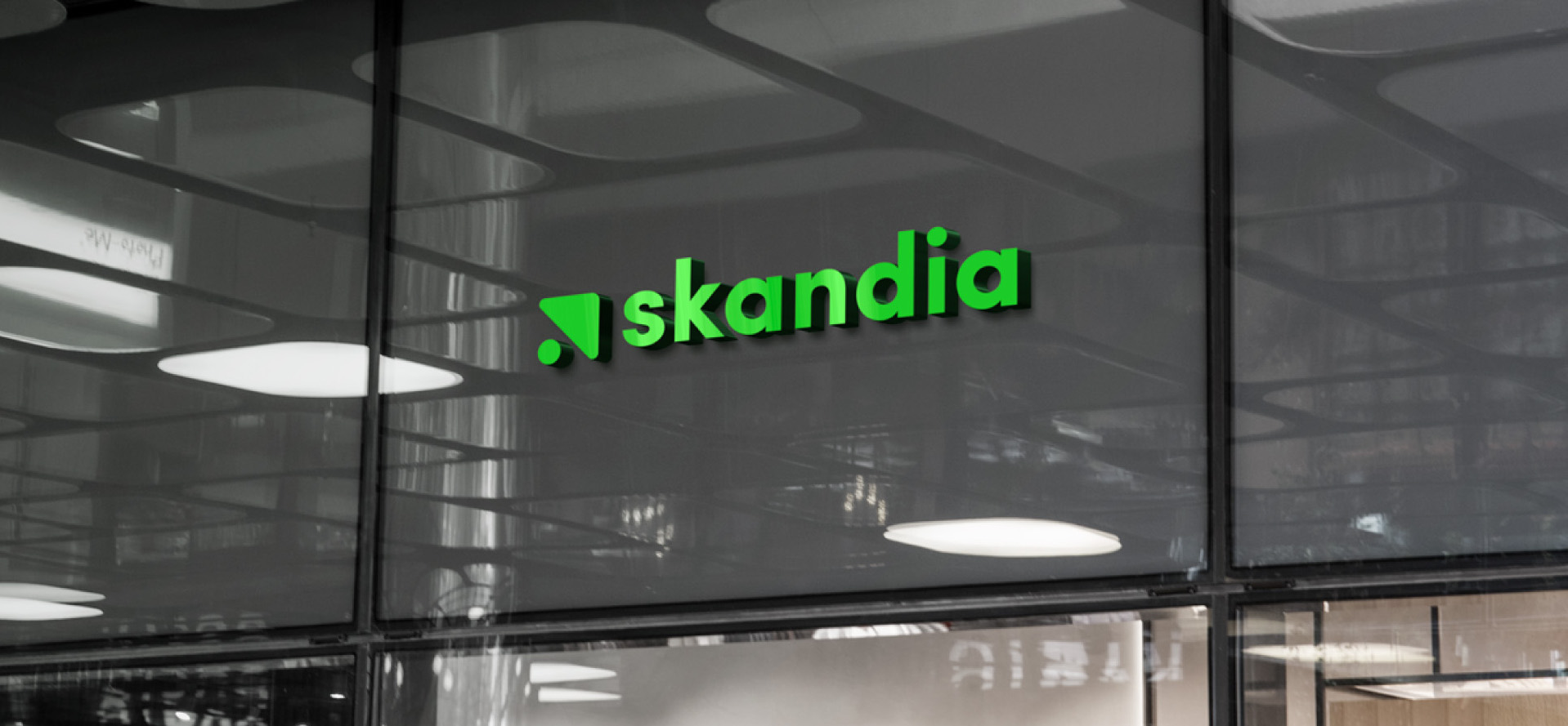
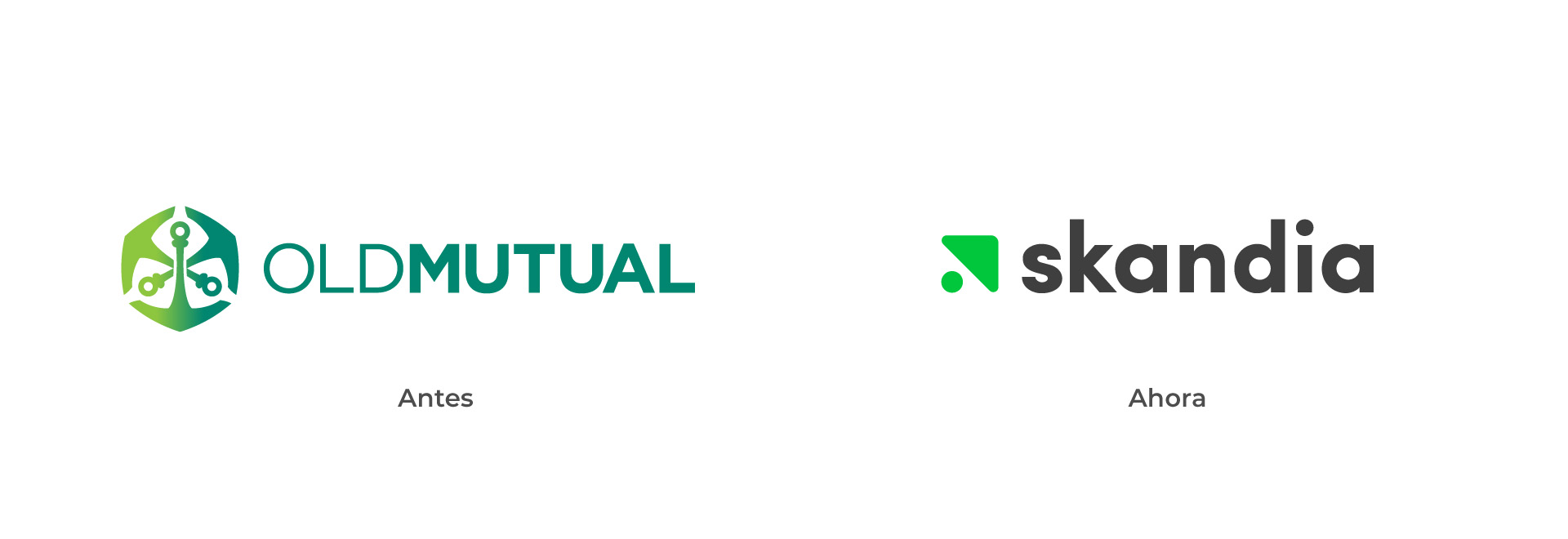
For many years Skandia, previously called Old Mutual, was recognized as a top brand in the finance market associated with retirement plans. After a change of shareholders at an international level, the brand comes back to life. This new starting point is represented in the new logo, where the starting point is accompanied with a triangle that gives it direction.
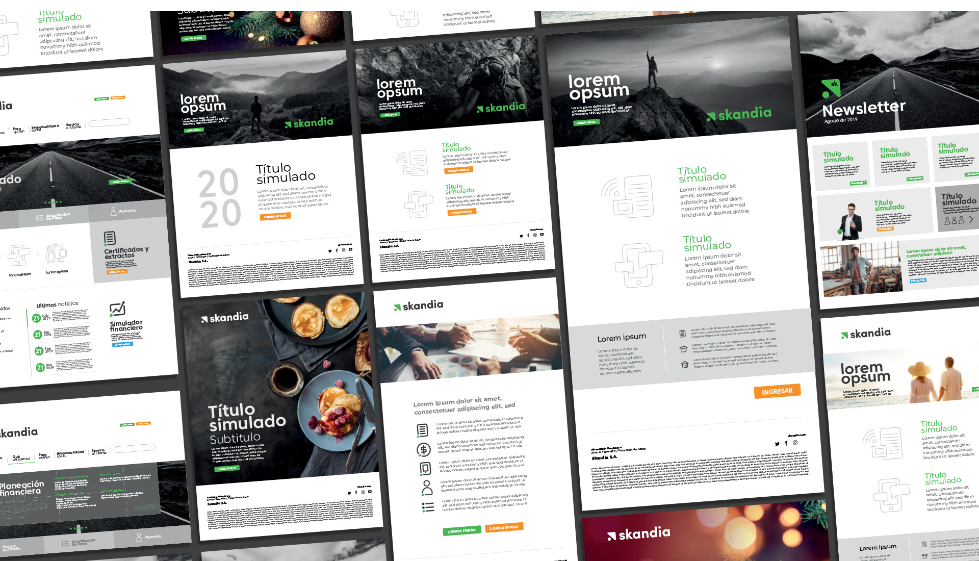
In this branding project we first defined the strategic route with our client. To visually portray the straegy, we took a dot and a triangle as main elements. These two form a unit that projects in time and space to an ever-rising line. From these simple elements we created a strong, coherent and visual identity that is characterized by its simplicity and impact. The dot and the triangle, which are a visual synthesis of an arrow, also represent a cursor in the digital world. This element opens paths for innovation, an essential concept of the brand.
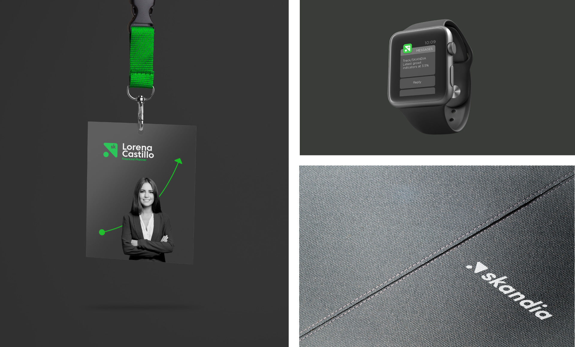
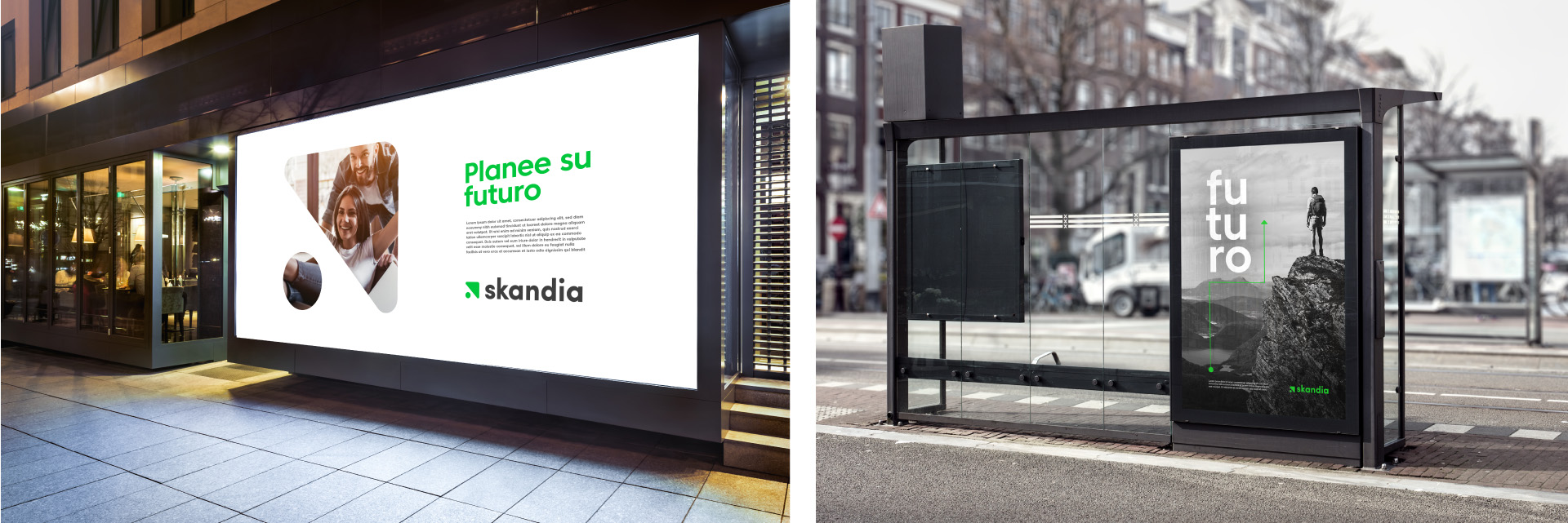
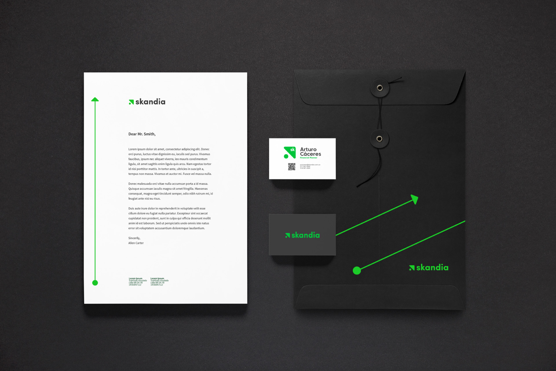
We were abe to refresh the brand. We took it closer to the digital world through a visual identity system that was designed based on the initial strategy. This visual identity transmits the core values of the brand: empower others to a brilliant financial future.
Info
Branding
