
Prissma







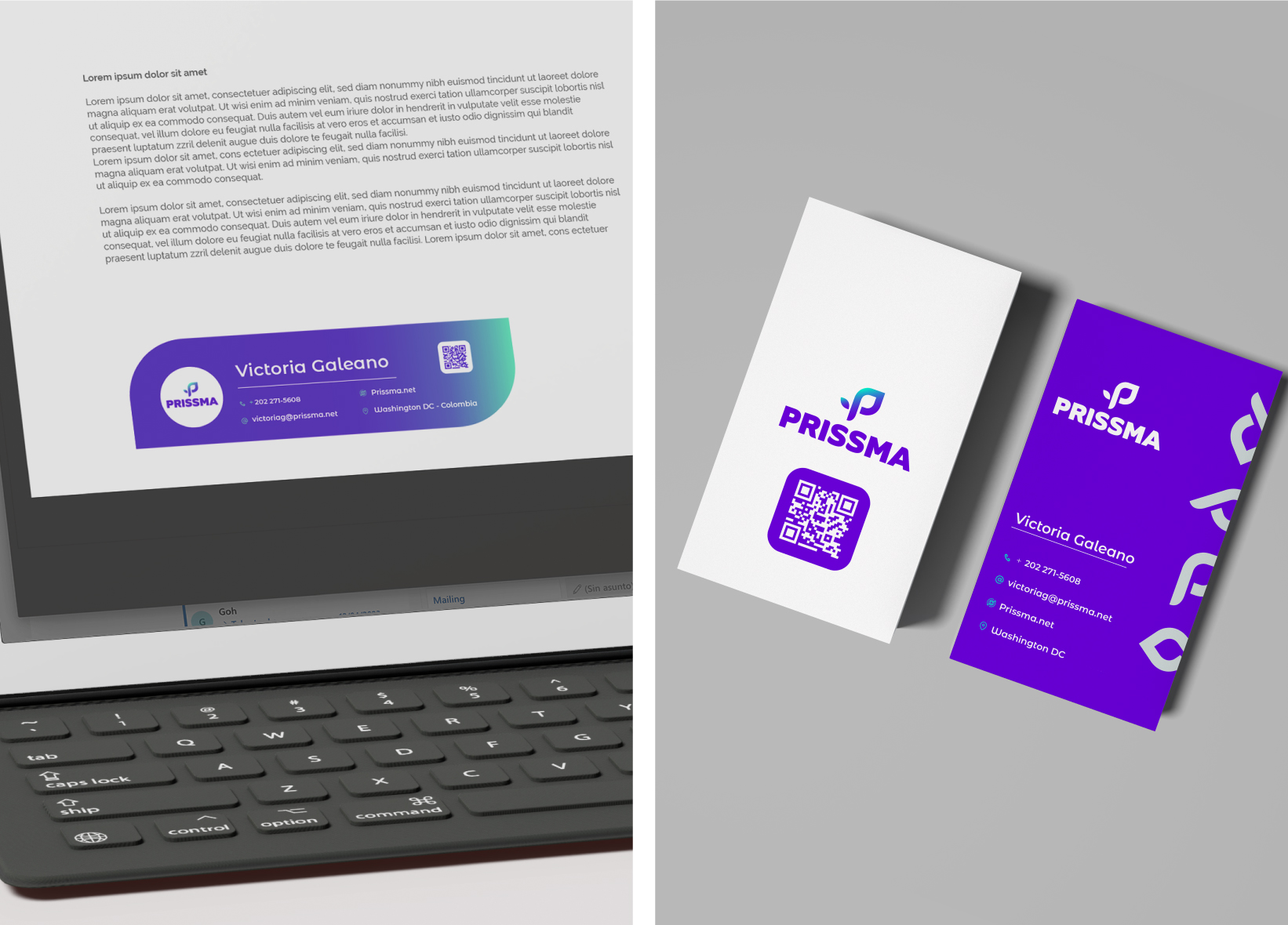

Prissma
Our challenge:
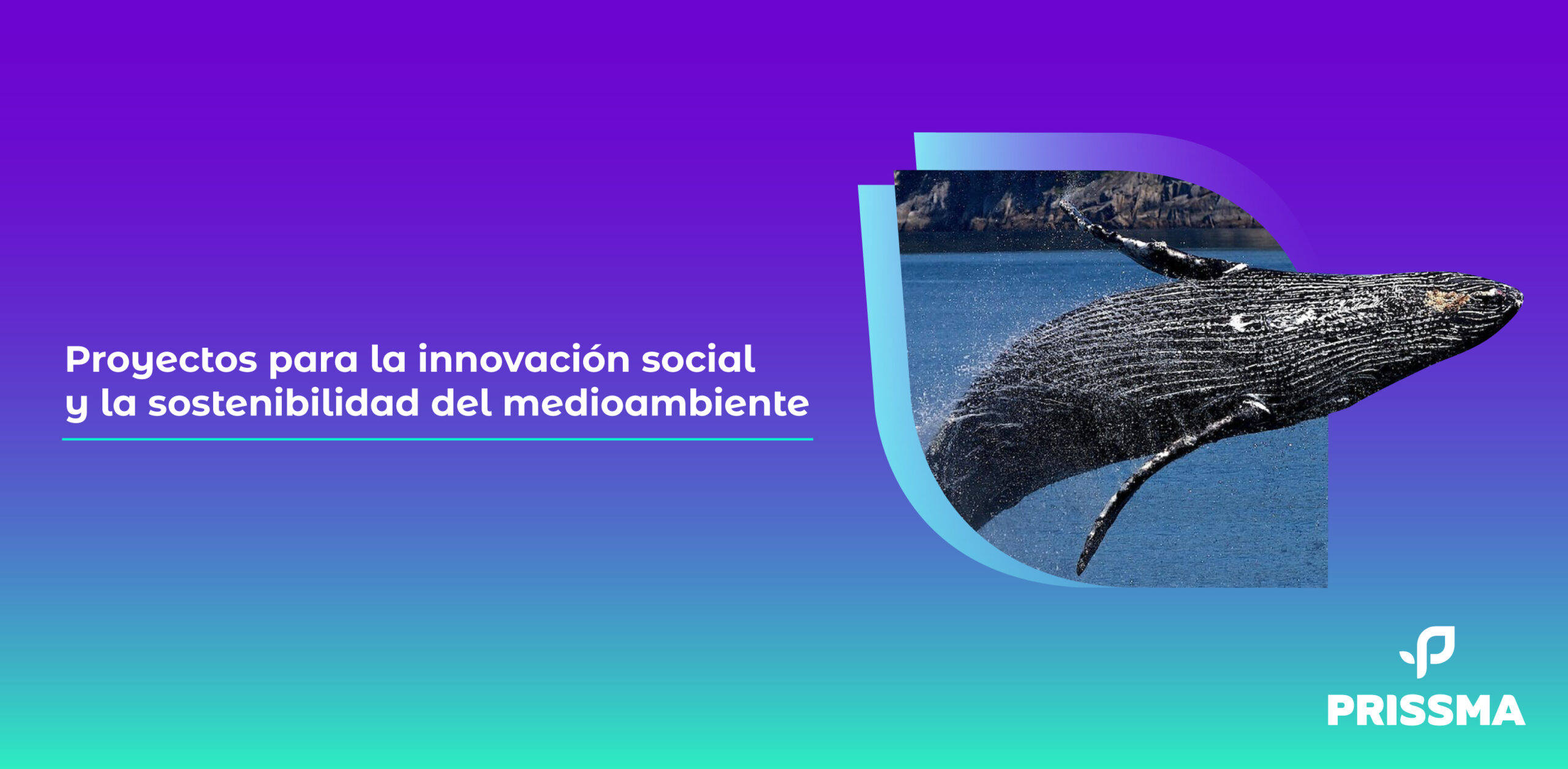
Design the graphic system to accompany the Prissma logo.
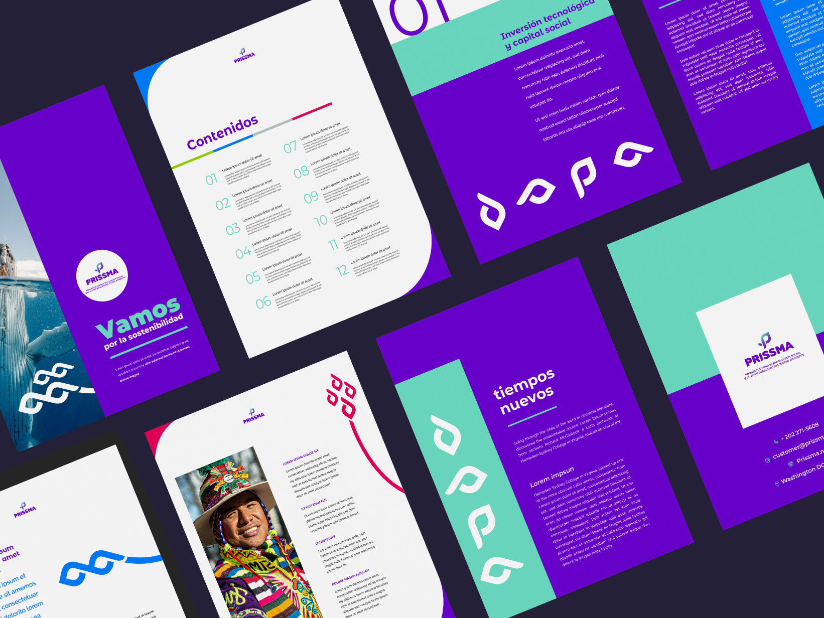
For this project, Prissma was looking for a complete guideline that would encapsule the vision of the brand. Although the brand had a recent rebranding, the client came to us with the need to complement the logo, establishing a visual language for different scenarios.
Prissma is an accelerator that connects environmental, climate and social initiatives with partners and capital to grow projects and companies. Through investment and technology consulting, Prissma aims to take organizations committed to sustainability to a higher level.
To begin with the project, we drew a strategic path, defining the brand’s DNA, since we believe that communication is expressed in all the brand’s touch points, both visual, written and face-to-face communications. As we had a clear DNA, we established bets and waivers in communication, especially in the graphic part.
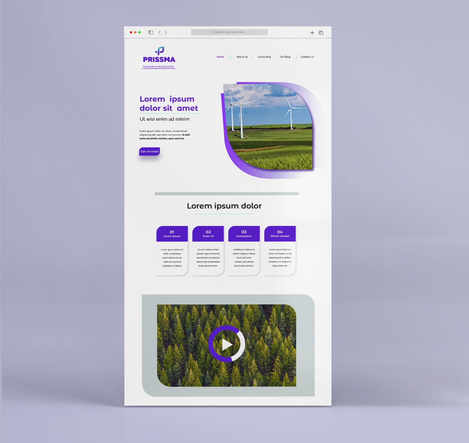
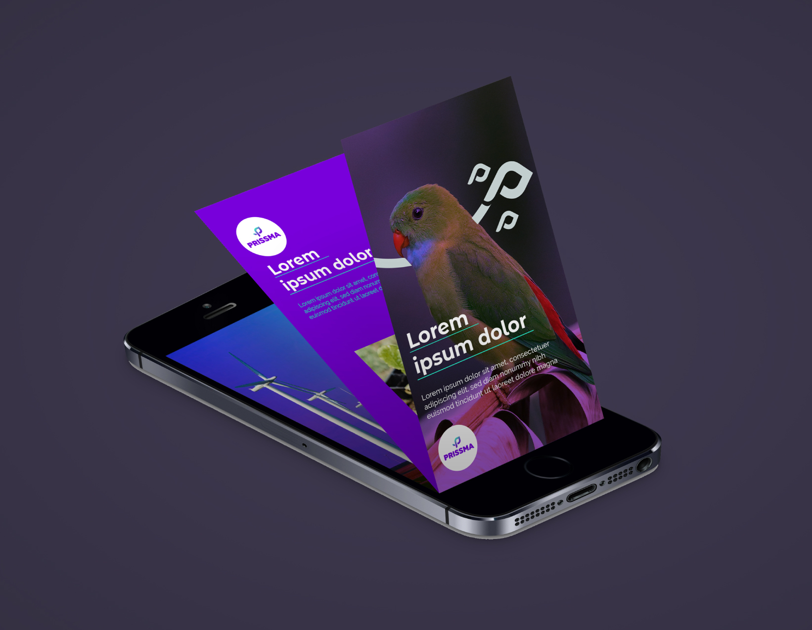
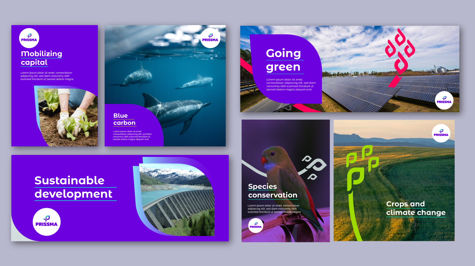
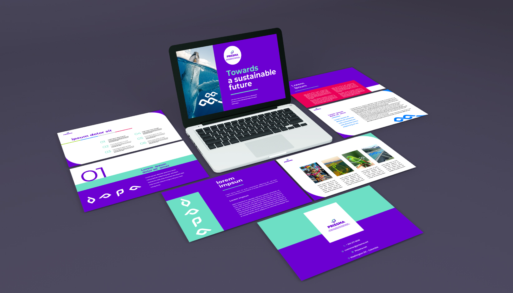
For the development of the graphic system we decided to focus on a communication tone that generates trust, transmits cleanliness and expertise while being at the forefront and generates influence. We complemented the color palette of the existing logo, expanding its possibilities and addressing the key themes for Prissma: social, environmental and technological sustainability. Additionally, we design dynamic, versatile and brand-specific graphic elements and compositions. Being the logo the starting point, the visual elements we developed allow differentiation from related companies thanks to the graphic system.
Info
Branding


