
Red PaPaz


Red PaPaz
Our challenge:
Organize and design the brand architecture and visual system for Red PaPaz.
Red PaPaz is a non-profit organization dedicated to the defense and promotion of the rights of children and teenagers, working in collaboration with parents, caregivers and educational communities in Colombia and Latin America.
With 20 years of experience and constant growth, Red PaPaz asked us to build a new Brand Architecture that would reorganize its portfolio of programs and services. During the initial brand audit, we identified a proliferation of disparate graphic elements: multiple logos, color palettes, typographies and visual styles that lacked coherence and were disconnected from the parent brand. This generated a fragmentation in the visual and conceptual narratives, weakening the positioning and the added value that the brand should project.
We analyzed the role of the main brand and its sub-brands, evaluating their synergies, target audiences and strategic purpose. Our main objective was to capitalize on each communication effort, giving greater value to the parent brand, optimizing marketing costs, maximizing visibility and outlining a clear path for long-term growth.
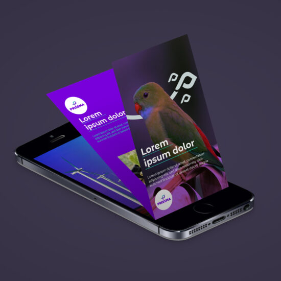
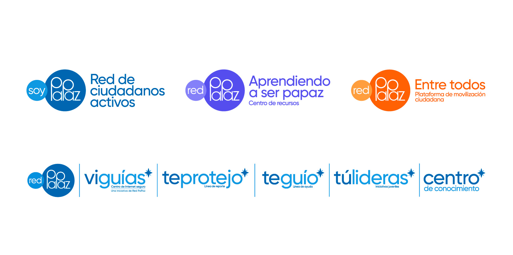
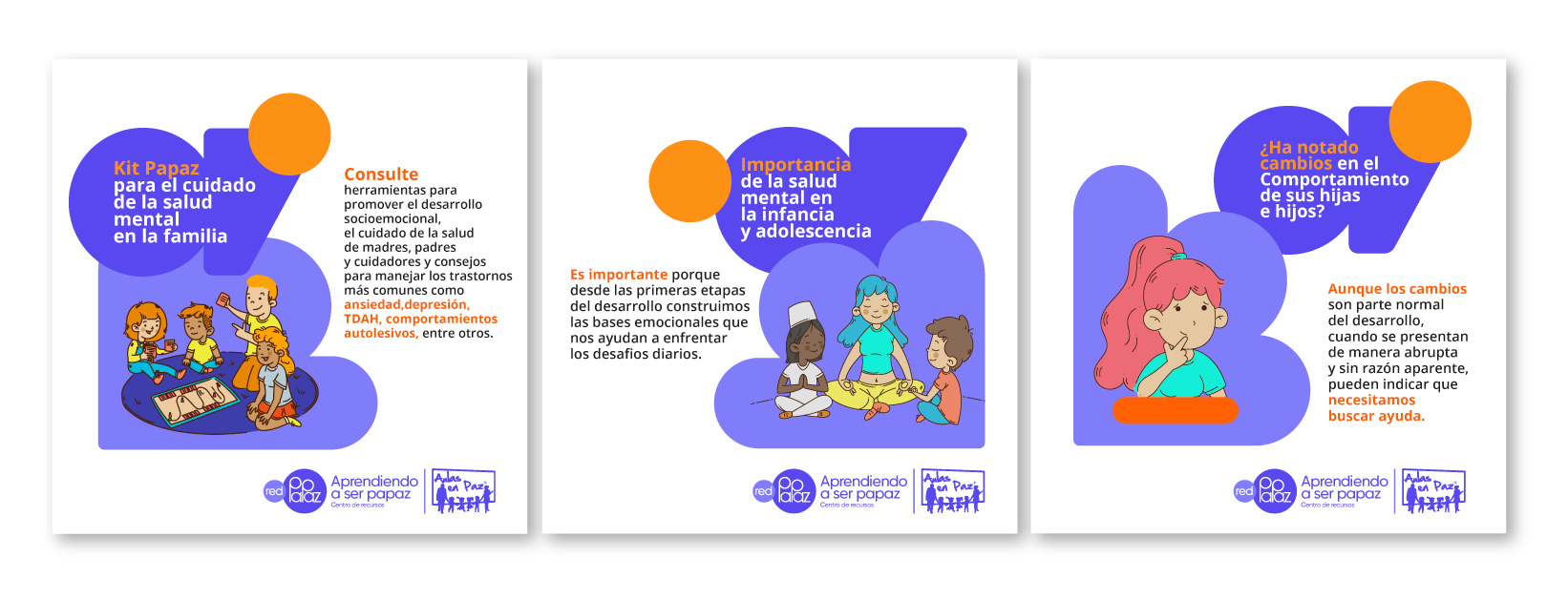
Our recommendation was to consolidate the architecture under a monolithic model, where all sub-brands and programs are visually and conceptually aligned under the identity of the parent brand. To this end, we developed a main logo with specific compositions for each program, accompanied by descriptors and a chromatic differentiation within the guidelines established by the parent brand.
The result is a clean, coherent and functional Brand Architecture that unifies all points of contact and strengthens brand recognition at an institutional level, providing clarity both internally and externally.
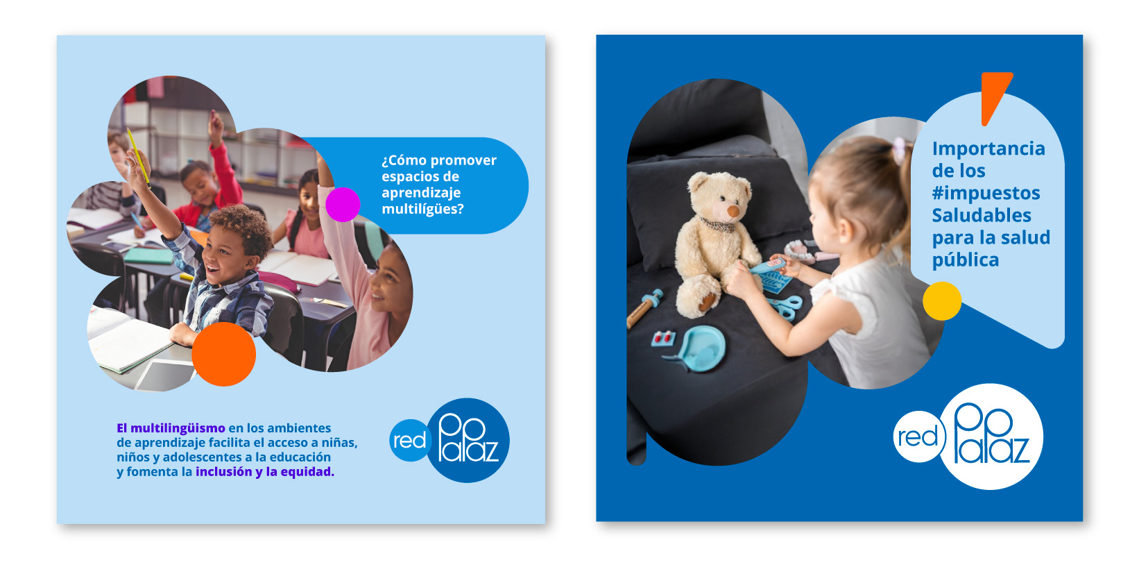
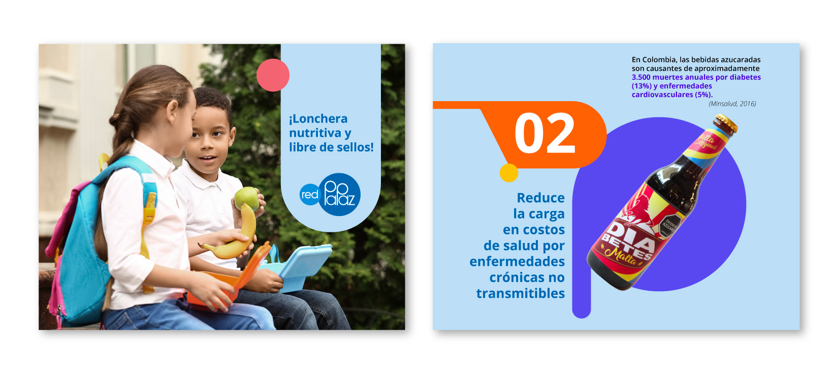
Once the brand architecture was completed, we proceeded to design the visual system as part of the second phase of the project. Through an active listening methodology, we conducted several collaborative sessions with the communication teams to identify their needs, critical points and operational challenges. The goal was to develop a comprehensive and coherent graphic system that would establish a strong and distinctive visual identity to represent both Red PaPaz and its programs.
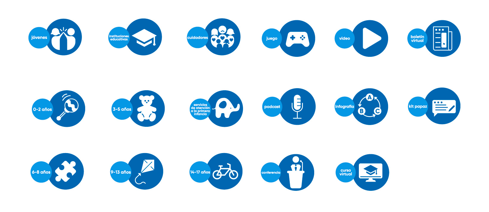
We designed an iconography to give distinctiveness to the brand, consistency in communication, reinforcing the message, improving the user experience while maintaining the essence of the brand in all types of applications.
This visual system not only ensures aesthetic cohesion between the different brand applications, but also facilitates adaptability across different platforms and channels, ensuring consistency across all touch points.
Info
Branding