
PeiGo








PeiGo
Our challenge:
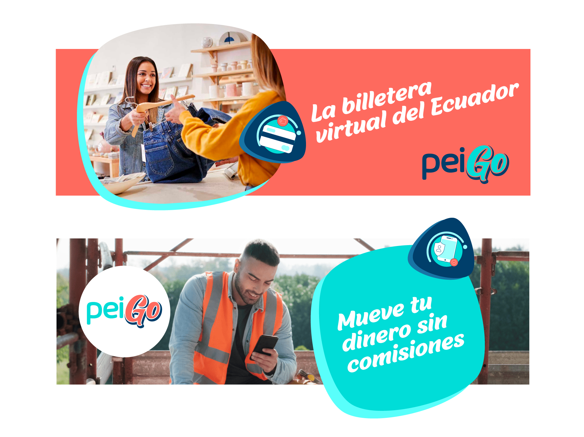
Designing the branding and visual identity for PeiGo. Banco Guayaquil of Ecuador came to us with the need to design a fresh and fun brand identity for their new virtual wallet.
Our team and our friends at Proximity BBDO, worked on a strategy for the brand, bringing to life its DNA, language, purpose and creative path. Based on the strategic approach, we designed a visual identity that would reflect the joy, drive and freshness of Ecuadorians.
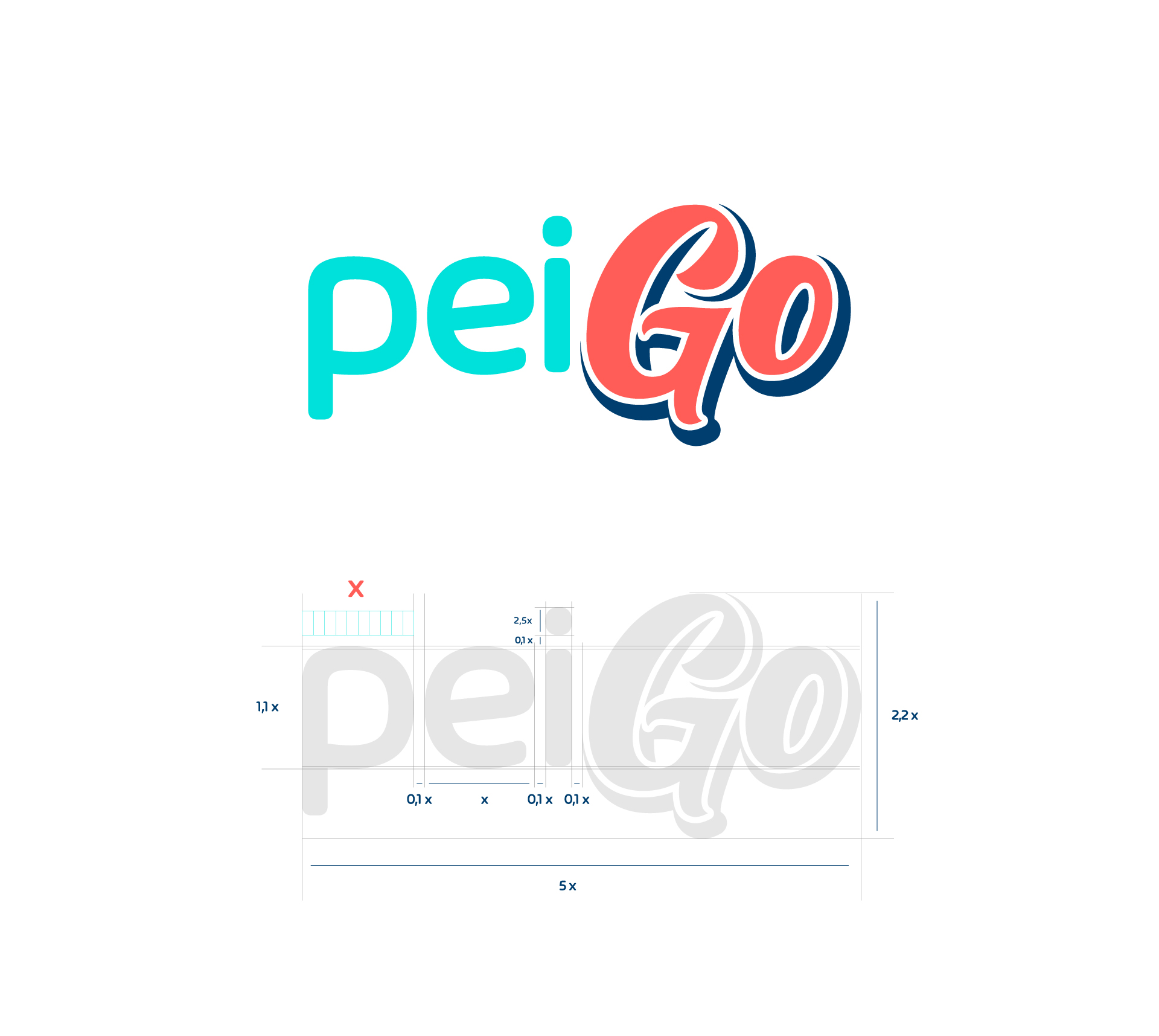
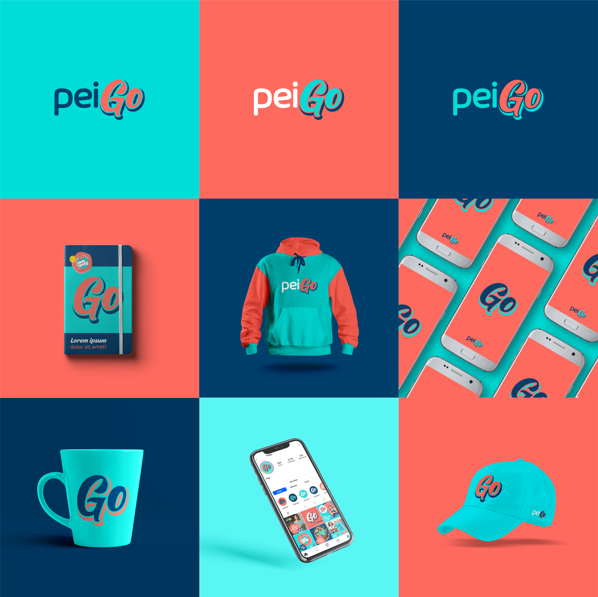
The result was a brand that encourages all people to use technology without fear. By rescuing visual elements from Ecuadorian popular culture, we defined a perfect typographic combination that blends the virtual financial world with the handmade letters of traditional Latin American advertisements. PeiGo’s cheerful colors promote closeness and familiarity with the audiences of this unique brand.
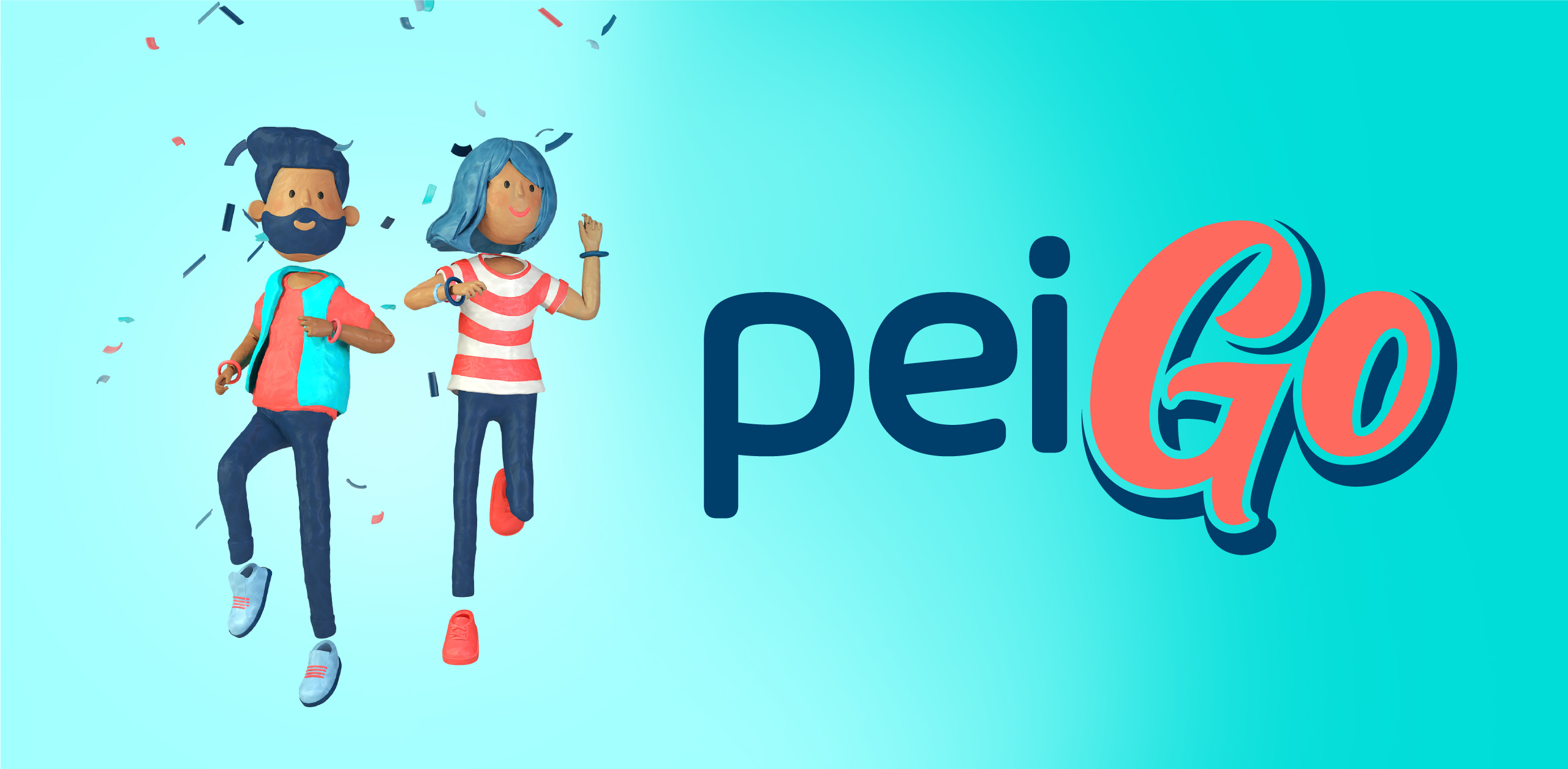
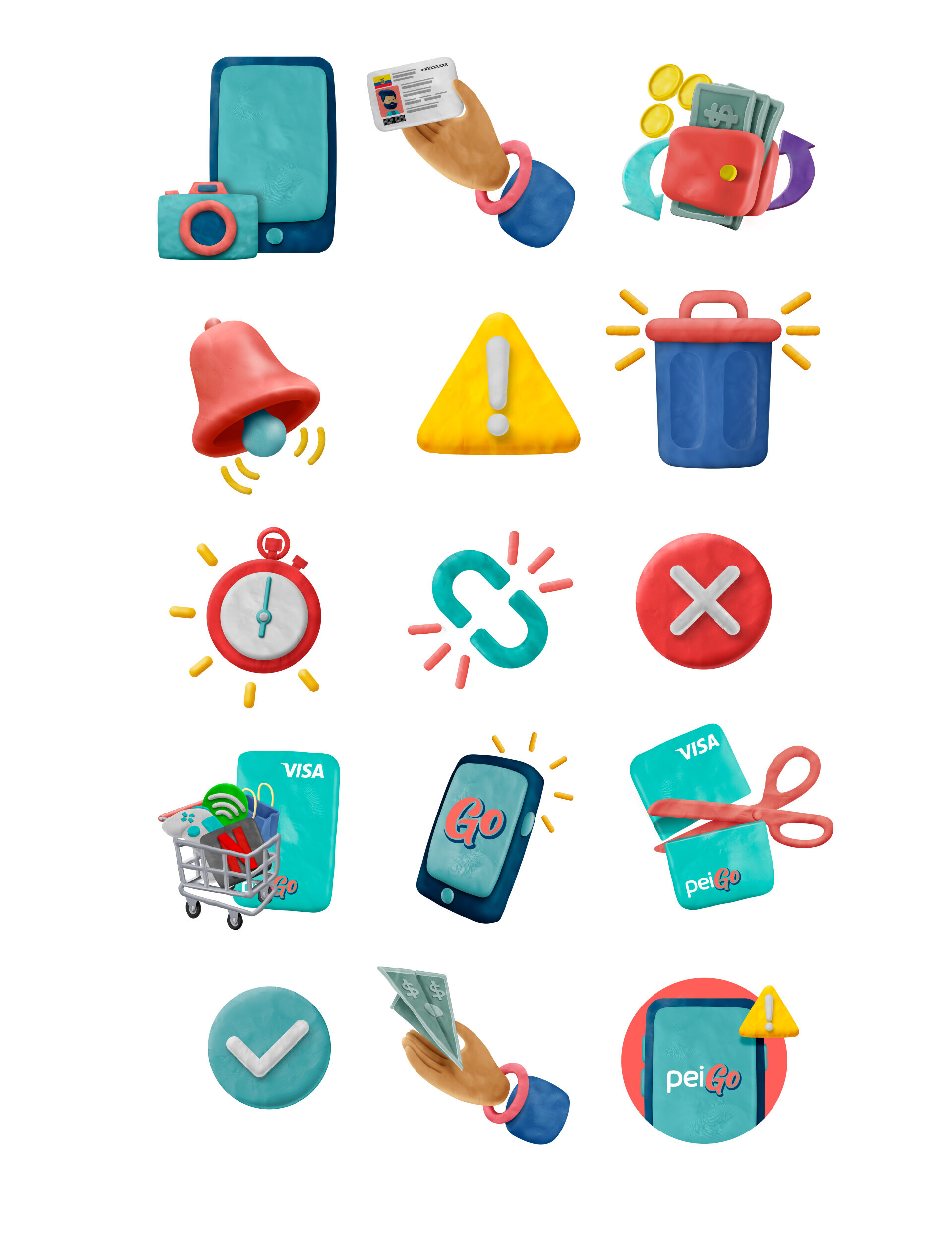
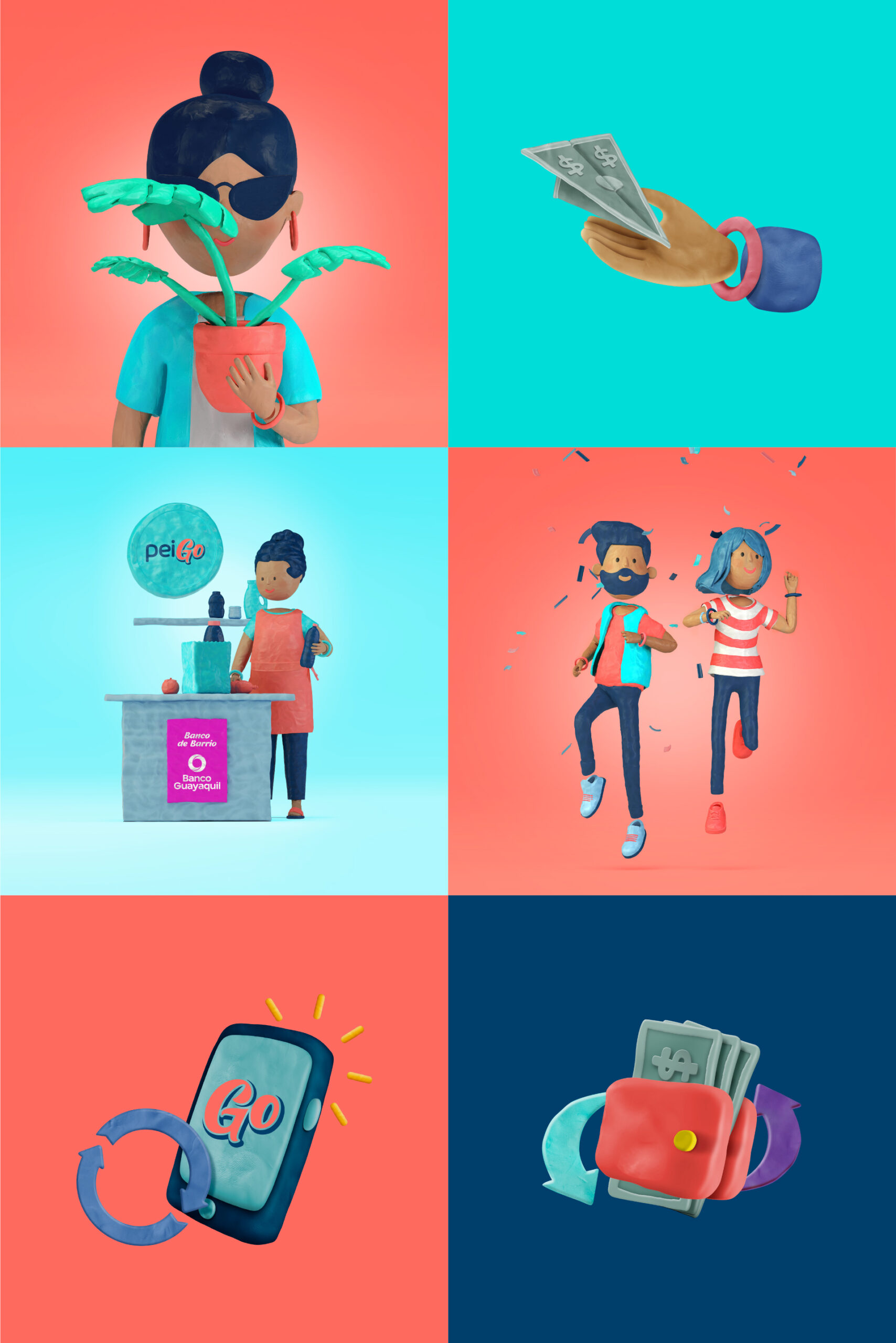
For the application notifications and visual elements we based ourselves on one of the brand’s objectives: to be as easy to use as plasticine. Anchored to this concept, we developed a line of illustration and 3D modeling with plasticine textures. These icons are used in large notifications within the application, as well as in communication pieces.
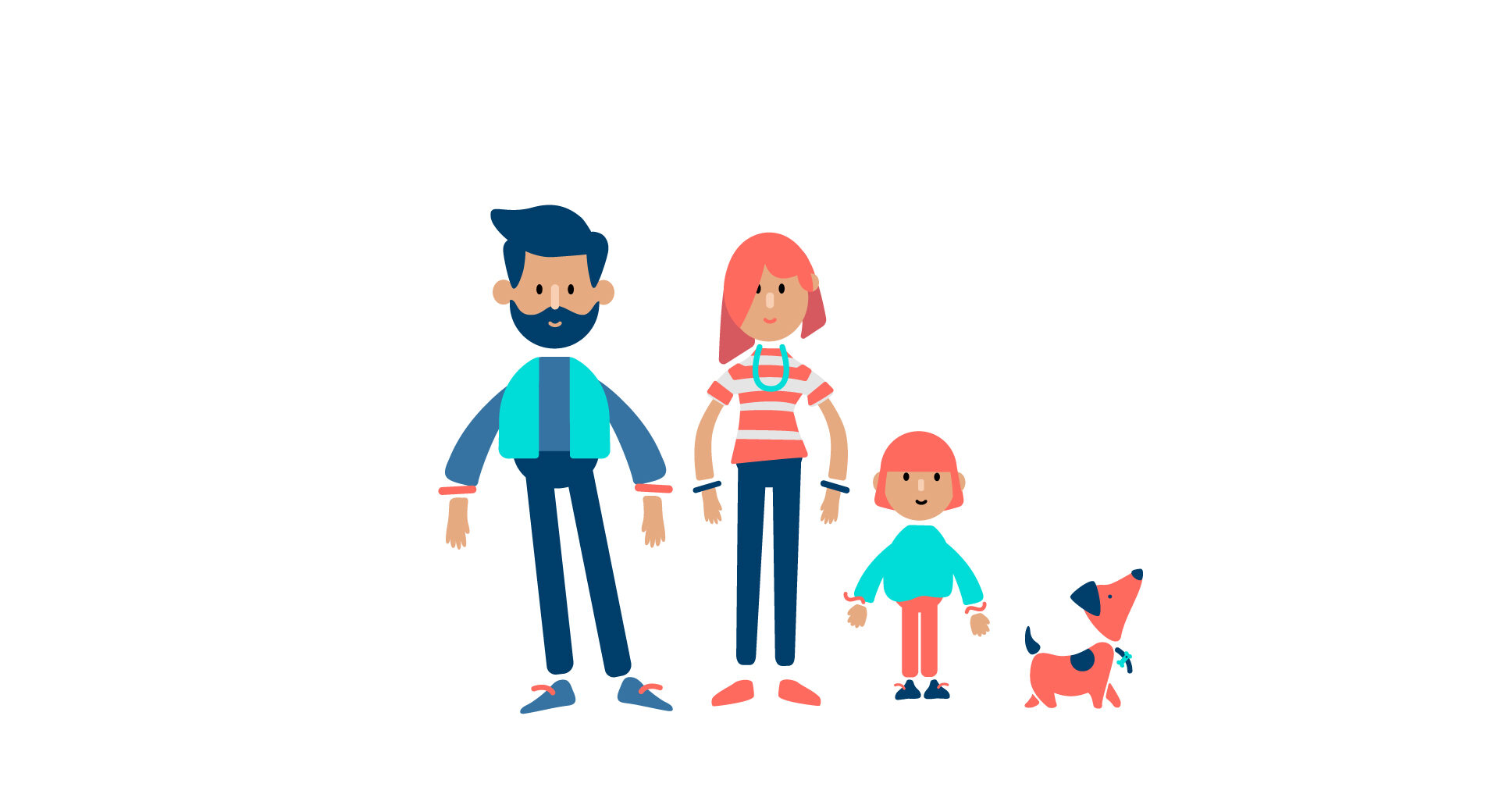
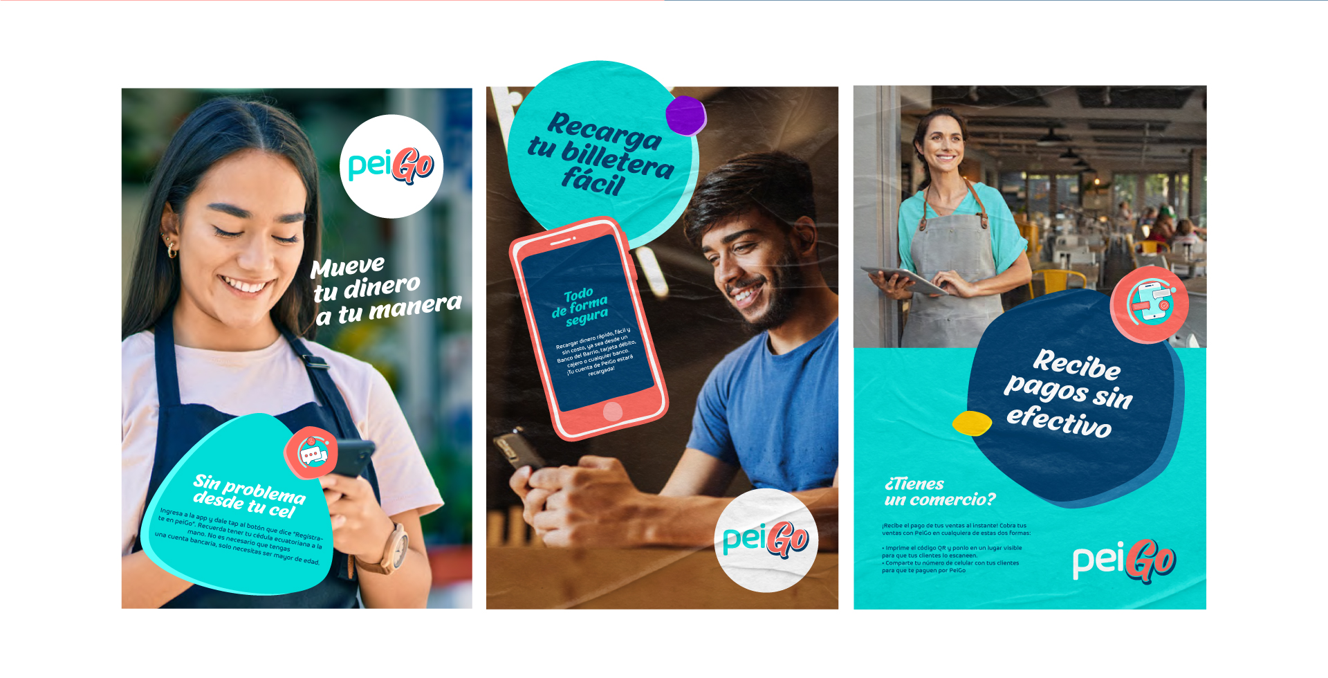
On the other hand, taking into account the importance of user experience (UX), we designed vector icons that accompany the brand at every touch point. In addition, as part of the branding we defined visuals for ATL and digital media, using photography, vectorial elements and compositions that appeal to Ecuadorian popular culture.
Info
Branding
