
Vima






Vima
The challenge of renewing a corporate identity is never easy, even more if the main reason to renew the brand is to expand into international markets such as the United States. Vima Foods, our client, asked us to make sure that during the rebranding process the brand’s essence remained at the core.
“A decisive time came to our business where we had the opportunity to start competing in the north American market. To address this new challenge, we knew we needed to renovate our visual identity. Now we are sure we made the right decision. The work and design made by SeñorLópez does not compare to others, this brand refresh was all we expected and more.” Edelmiro Iglesias, CEO Vima Group.
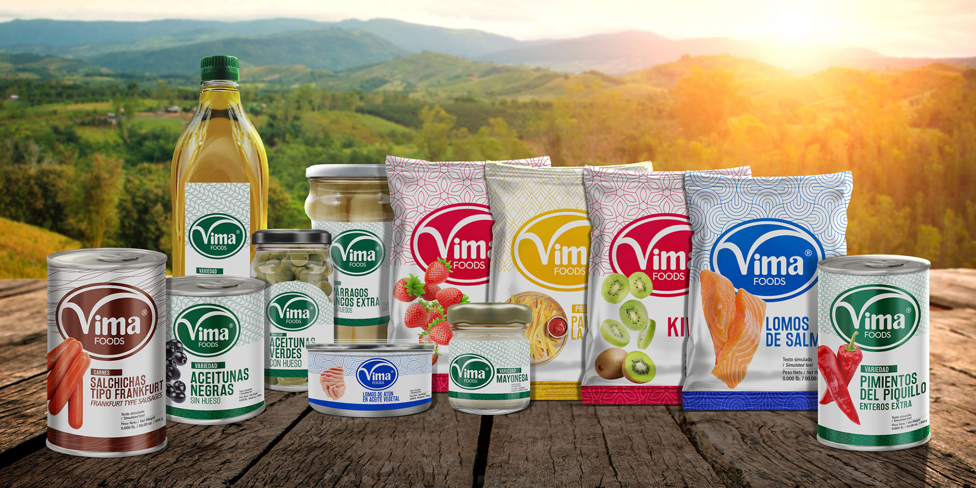
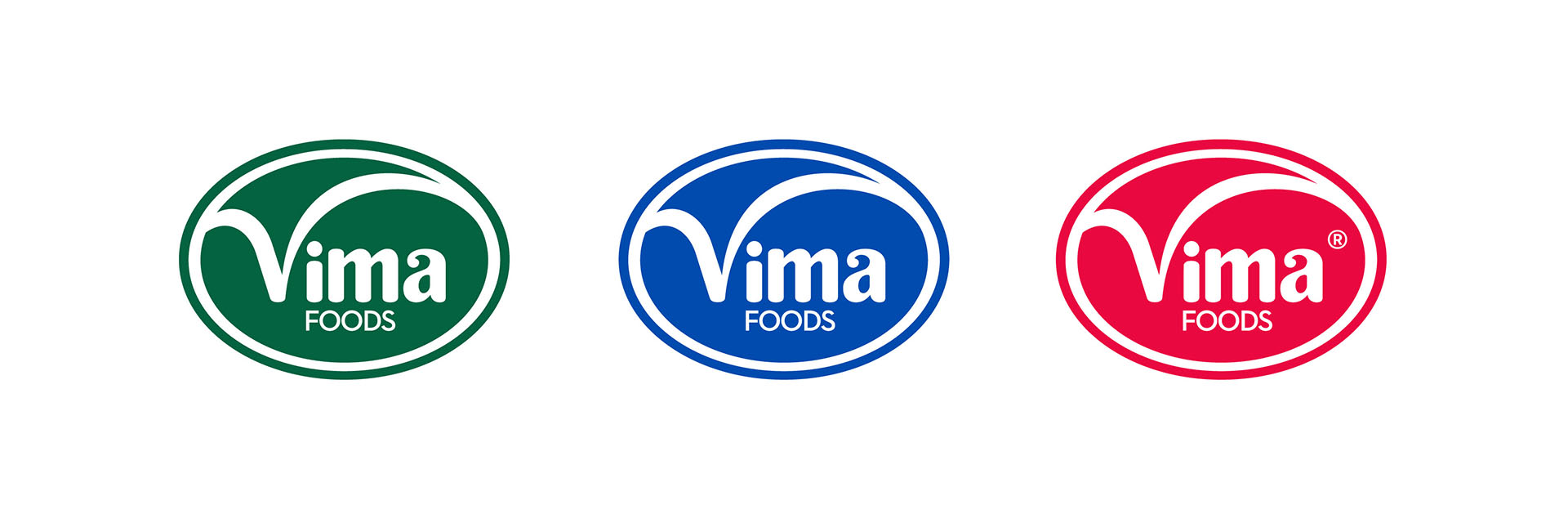
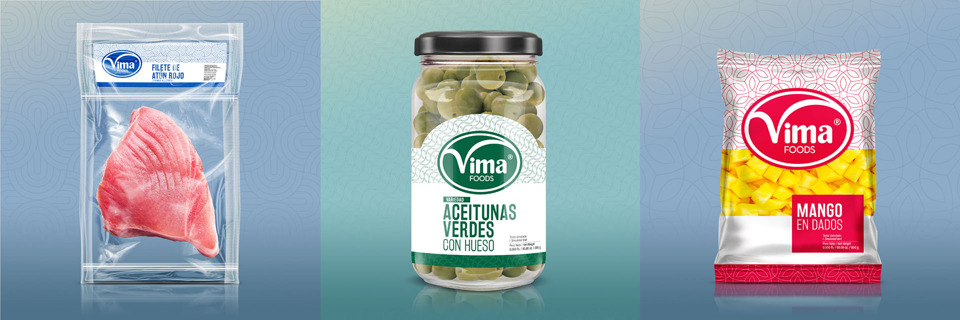
The result was spot on. We met the goal of making Vima reborn with a fresh new corporate identity. The logo, visual system and packaging design portray a fresh brand. We created a perfect balance between the visual assets of the brand, bringing their products to a modern expression.
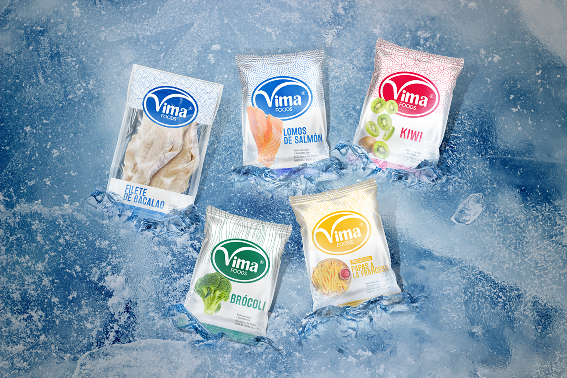
Now Vima’s products look fresh and contemporary After redesigning the corporate identity of Vima, we worked on its brand and packaging architecture. By using our own methodologies, we defined the key elements and hierarchy system in order to design the packaging. We did all this keeping our main objective in mind: making the customer’s decision easy in the point of purchase. When customers seek their products, they will easily identify between products thanks to the coherence between products and the color system in their packaging. Each product line has a key color that help costumers identify different food categories.
Info
Branding, Packaging


